Part 5 – Applying Styles and Themes to Kendo UI Widgets
In today’s post I will help you to apply styles and themes provided by Kendo UI to the elements in your page. These styles and themes can be applied to not only the widgets but also to the native elements in the page too.
Kendo UI comes with a number of predefined themes that can be applied to your page and to incorporate it in your page, you needs to include two css files in the head section.
kendo.common.css – contains all the styles for positioning and widget dimensions
kendo.{theme name}.css – contains the theme specific styles
Note : The common.css file is mandatory, if you want your widgets to appear and function correctly.
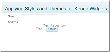
Let’s build a page with two text boxes, one hyperlink and a button and then we can apply the styles and themes in it.
<div > <div > <div ><span><h3>Applying Styles and Themes for Kendo Widgets</h3></span></div> </div> <div > <div > <div >Name</div> <div><input type="text" id="txtName" /></div> </div> </div> <div > <div > <div >Address</div> <div ><input type="text" id="txtAddress" /></div> </div> </div> <div > <div > <div > </div> <div > <a href="#" >Clear</a> <input type="button" id="btnSubmit" value="Search" /> </div> </div> </div> </div>
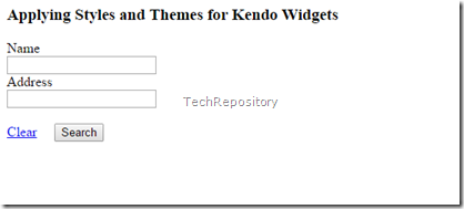
If you run this page in the browser now, the output will be
Applying Styles
Let’s apply some styles to the elements provided by Kendo and for that we just need to include the common.css file. Here’s I’m going to include the kendo.common.min.css file which is a minified version of the original file.
<link href="../css/kendo.common.min.css" rel="stylesheet" />
To allow common styling, Kendo UI uses same css classes for different widgets as well as html elements. So in order to avoid naming conflicts they prefixed these classes with “k-“ and these common classes help you to change the styles at a global level. We will be using the following styles in our page,
k-textbox – for styling input element to set border, text and background color
k-link – applied for hyperlinks to set text color
k-button – applied for buttons, to set border, background color/image and hover styling.
Please go through this link to know about the complete list of primitives available in Kendo UI.
So our HTML snippet will be
<div> <div> <div class="k-header"><span><h3>Applying Styles and Themes for Kendo Widgets</h3></span></div> </div> <div> <div> <div>Name</div> <div><input type="text" class="k-textbox" id="txtName" /></div> </div> </div> <div> <div> <div>Address</div> <div><input type="text" id="txtAddress" class="k-textbox" /></div> </div> </div> <div> <div> <div> </div> <div> <a href="#" class="k-link">Clear</a> <input type="button" id="btnSubmit" value="Search" class="k-button" /> </div> </div> </div> </div>
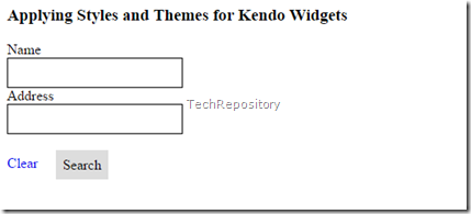
And the page will render as follows,
Applying Themes
So you will notice now that visually some changes has occurred in the page, but it’s still not good looking. So let’s apply the default theme provided by Kendo UI to our head section.
Code snippet for including the default theme
<link href="../css/kendo.common.min.css" rel="stylesheet" />
<!--Kendo UI default theme-->
<link href="../css/kendo.default.min.css" rel="stylesheet" />
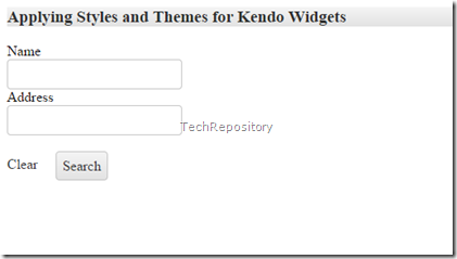
When the default theme is applied, the elements in the page has rounded edges, background color for title etc and it’s much more visually appealing than the earlier one.
Let’s change the default theme and include Blue Opal theme, for that the second statement needs to be changed to
<link href="../css/kendo.common.min.css" rel="stylesheet" />
<!--Kendo UI default theme-->
<link href="../css/kendo.blueopal.min.css" rel="stylesheet" />
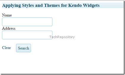
When the BlueOpal theme is applied, all the gray color for the border and background color changed to Light Blue with just one change.
Adding BootStrap
I have one more up the sleeve before winding up this post and it’s about incorporating Bootstrap in our page. Bootstrap is one of the widely used framework based on HTML5, CSS and JS for developing responsive, mobile first pages and for more information is available at their website.
Including them in our page is super easy, download the package from their site, copy the css and js files to appropriate folders in the root directory, add the reference for css and js files in the head section and that’s all we need to power our page based on Bootstrap.
    <!-- Latest compiled and minified CSS -->
    <link rel="stylesheet" href="../css/bootstrap.css" />
    <!-- custom styles -->
    <link rel="stylesheet" href="../css/custom.css" />
    <!-- Latest compiled and minified JavaScript -->
    <script src="../js/bootstrap.min.js"></script>
I have added some extra styles for my page and saved that in a file name custom.css and it’s contents is given below.
.voffset  { margin-top: 2px; }
.voffset1 { margin-top: 5px; }
.voffset2 { margin-top: 10px; }
.voffset3 { margin-top: 15px; }
.voffset4 { margin-top: 30px; }
.voffset5 { margin-top: 40px; }
.voffset6 { margin-top: 60px; }
.voffset7 { margin-top: 80px; }
.voffset8 { margin-top: 100px; }
.voffset9 { margin-top: 150px; }
I used the grid layout provided by Bootstrap for aligning the elements in the page. There are lot of online tools available in the web create layouts based on Bootstrap and I created the mark up in my page from the site www.shoelace.io
<div class="container"> <div class="row "> <div class="col-md-10 k-header"><span><h3>Applying Styles and Themes for Kendo Widgets</h3></span></div> </div> <div class="row voffset1"> <div class="col-md-5"> <div class="col-sm-2">Name</div> <div class="col-sm-2"><input type="text" id="txtName" class="k-text-box" /></div> </div> </div> <div class="row voffset1"> <div class="col-md-5"> <div class="col-sm-2">Address</div> <div class="col-sm-2"><input type="text" class="k-text-box" id="txtAddress" /></div> </div> </div> <div class="row voffset1"> <div class="col-md-5"> <div class="col-sm-4"> </div> <div class="col-sm-4"> <a href="#" class="k-link">Clear</a> <input type="button" class="k-button" id="btnSubmit" value="Search" /> </div> </div> </div> </div>
And you can see the difference, if you are good at designing the pages then also you can achieve the same without BootStrap too.But it has got some distinct advantages over most of the frameworks available now and that’s it widely used.
That’s it for the time being and till next time, Happy Coding !!!
No Comments
Connecting Azure Blob Storage account using Managed Identity
Posted 12/9/2022Securing Azure KeyVault connections using Managed Identity
Posted 11/26/2022Manage application settings with Azure KeyVault
Posted 11/9/2022Adding Serilog to Azure Functions created using .NET 5
Posted 4/3/2021Learn how to split log data into different tables using Serilog in ASP.NET Core
Posted 4/23/2020
