Part 3 – Setting Widget Properties
So far in the series we have already seen how to incorporate Kendo UI in web pages and also how to initialize it. Please visit my last post to if you needs to recollect it. In this post I will be explaining how to set various options available for a widget.
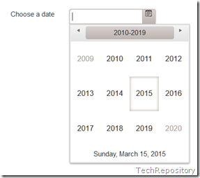
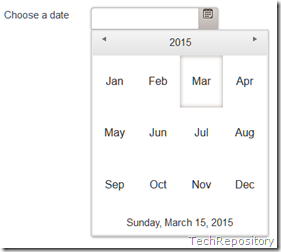
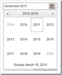
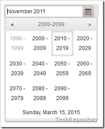
First, let’s see how we can set values for options while initializing the widget itself. I am going to use the DatePicker widget itself and will set the values for the start and format options of the widget. The start option specifies the start view when we click on the calendar icon in the textbox for the first time. Available options for the same is given below.
month | year | decade | century |
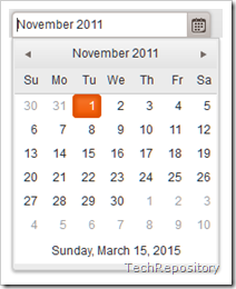 |  |  |  |
To set the display format of the date we can make use of the format option which is also used to parse the input. In this example I will be using the format string “dd-MMM-yyyy” which will display the date as 24-Oct-2015. The list of supported formats can be found here.
Code Snippet
 <div class="col-md-4"><input type="date" id="jQDatePicker" /></div>

<script>
$("#jQDatePicker").kendoDatePicker(
{
        start: "decade",
        format: "dd-MMM-yyyy"
});
</script>
Output
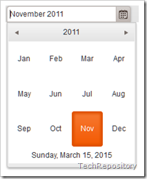
Now we will see how we set the options after the widget is initialized. We will be using the setOptions method for achieving the same.
Code Snippet
<div class="col-md-4"><input type="date" id="jQDatePicker" /></div>
<script>
              $("#jQDatePicker").kendoDatePicker();

            //using jquery data method
            var datePicker = $("#jQDatePicker").data("kendoDatePicker");

            datePicker.setOptions({
                start: "year",
                format: "MMMM yyyy",

            });
</script>
In the above code snippet I am using the jQuery selectors to initialize the widget using the kendoDatePicker function defined in the kendo framework. In the second statement I am using jQuery’s data method to retrieve the widget instance and then uses the setOptions method to define the properties for the widget.
You can also use the getKendoDatePicker method to get the widget instance instead of the jquery data method.
var datePicker = $("#jQDatePicker").getKendoDatePicker();
Output
That’s how we can specify the options available for a widget and complete list of available options for the DatePicker widget can be found here. That’s all I have for this post and in the next one we will be dealing with the binding of events for the widgets. Till then, Happy Coding !!!!
No Comments
Connecting Azure Blob Storage account using Managed Identity
Posted 12/9/2022Securing Azure KeyVault connections using Managed Identity
Posted 11/26/2022Manage application settings with Azure KeyVault
Posted 11/9/2022Adding Serilog to Azure Functions created using .NET 5
Posted 4/3/2021Learn how to split log data into different tables using Serilog in ASP.NET Core
Posted 4/23/2020
