Web Developement
ASP.MVC 6 Features - All New Tag Helpers
We are using HTML helpers in our view pages extensively while building apps in MVC untill now. The main disadavantage of this is that it follows server side syntax and it's mix and match with html code in the page. It makes the maintainablity a tedious one and also readablity is affected.
@Html.Label("Name","Name")In ASP.NET MVC 6 we have the tag helpers which helps you achieve the same thing but this time we are writing using the HTML markup. So the equivalent code for above statment in MVC 6 will be
<label asp-for="Name"></label>
will generate the following HTML when rendered in browser
<label for="Email">Email</label>
Here the asp-for attributes extracts the display name attribute from the specified model property and displays it as the label for the control.
Let's add a class to the above control and see the difference between HTML Helpers and Tag Helpers
HTML Helper
@Html.Label("Name","Name", new {@class="label-caption"})Tag Helper
<label class ="label-caption" asp-for="Email">Email</label>
Generated HTML
<input name="Name" class="label-caption" id="Name" type="text" value="">
What's new in ASP.NET MVC 6
ASP.NET MVC 6 is built on top of ASP.NET Core 1.0 and it's MVC and Web API combined into one single package.
ASP.NET Core 1.0 is the latest version of the web framework from Microsoft built on top of the new .Net Core framework. It was earlier known as ASP.NET 5 but was changed lately to ASP.NET core. The naming caused a lot of confusion among the developer community with existence of ASP.NET 4.6 version. Since ASP.NET 5 is completely new and built from scratch, giving the version as 5 was little bit off also. This version of the framework has undergone significant changes to the architecture and now it's open source also.
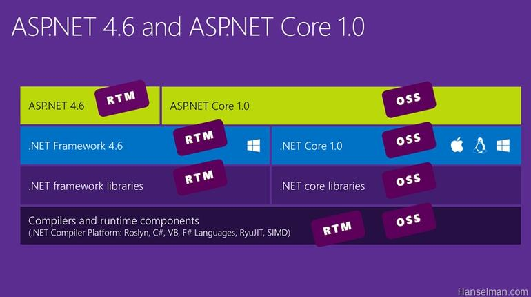
Pic Courteousy : Scot Hanselman's blog
Getting Started With ASP.NET Web API 2
Recently Microsoft revamped the Web stack and now it has become a unified framework for writing server side web applications and APIs. One of the major change is renaming ASP.NET 5 to ASP.NET Core 1.0. There was considerable amount of confusion between ASP.NET 4.6 and ASP.NET 5, since ASP.NET 5 is a significant change from the past they decided to adopt a completely new name for it.
ASP.NET MVC 6 is now part of ASP.NET Core and it’s a completely unified framework now.In the earlier version there was an WebApi framework which has got some code from the MVC framework and it was making life difficult for the developers at Microsoft. If they made some changes in one area then they needed to make the same in other area too there by maintaining it became a difficult task. So in MVC 6 they merged both these to create a unified one and takes a simple approach for developing web apps and API.
Let’s see how we can create a new Web API using MVC 6.
I am using Visual Studio Community 2015 with Update 1 for this post and depending on your installation, the screens and options may vary. Visual Studio Community 2015 a free version of Visual Studio and is available for download from here.
Create a new project using the ASP.NET Web Application from the New Project Dialog box

Upgrading Orchard to v1.9
The blokes at Orchard has released a new version of their popular content management system bumping it to 1.9. You can read more about it here detailing the features added and bug fixes. If you are using Orchard as your CMS, the following steps will help you to migrate to the latest version.
First of all to check the version of your Orchard instance, log on to your admin dashboard and scroll down to bottom right of the page.

There are multiple options for upgrading the instance which is detailed in this blog post and I will be using the approach. In this approach I will be using a copy of the site in my local machine which acts as a staging site and will upgrade the Orchard in this instance and if every thing is fine then will upload the files back to the production site.
Step 1 : Backup
It is very important to take the back up of the production site and the database so that we will be able to restore it back to the original state as a last resort if something catastrophic happens. Also if you are using the SqlCe database make sure that the sdf file inside App_Data folder is also backed up.
Step 2 : Download the latest version
You can download the package from the Download section in the Orchard website, but for my case I will be cloning the full source code from the GitHub Repository which is detailed in this blog post. Once the cloning is completed the folder structure will look like as given in the figure below.

Part 5 – Applying Styles and Themes to Kendo UI Widgets
In today’s post I will help you to apply styles and themes provided by Kendo UI to the elements in your page. These styles and themes can be applied to not only the widgets but also to the native elements in the page too.
Kendo UI comes with a number of predefined themes that can be applied to your page and to incorporate it in your page, you needs to include two css files in the head section.
kendo.common.css – contains all the styles for positioning and widget dimensions
kendo.{theme name}.css – contains the theme specific styles
Note : The common.css file is mandatory, if you want your widgets to appear and function correctly.
Let’s build a page with two text boxes, one hyperlink and a button and then we can apply the styles and themes in it.
<div > <div > <div ><span><h3>Applying Styles and Themes for Kendo Widgets</h3></span></div> </div> <div > <div > <div >Name</div> <div><input type="text" id="txtName" /></div> </div> </div> <div > <div > <div >Address</div> <div ><input type="text" id="txtAddress" /></div> </div> </div> <div > <div > <div > </div> <div > <a href="#" >Clear</a> <input type="button" id="btnSubmit" value="Search" /> </div> </div> </div> </div>
Part 4 – Binding Events to Kendo UI Widgets
Each widget available in Kendo UI exposes different events depending on the features available for each one of them. For example the DatePicker widget exposes events like open, change, close etc. Like in widget configuration, Kendo UI provides the ability to bind the events during the initialization phase itself as well as after the widget creation too.
Binding Events
First, we will see how we can bind events during the initialization phase.
<div class="col-md-4"><input type="date" id="jQDatePicker" /></div>

<div class="col-md-8"><span id="spResult"></span></div>
<script type="text/javascript">

    $(document).ready(function () {
        $("#jQDatePicker").kendoDatePicker({
            start: "decade",
            format: "dd-MMM-yyyy",
            change: DatePickerOnChange

        });
    });
    function DatePickerOnChange() {
        var resSpan = $("#spResult");
        resSpan.append("Changed date<br>");
    }

</script>
Part 3 – Setting Widget Properties
So far in the series we have already seen how to incorporate Kendo UI in web pages and also how to initialize it. Please visit my last post to if you needs to recollect it. In this post I will be explaining how to set various options available for a widget.
First, let’s see how we can set values for options while initializing the widget itself. I am going to use the DatePicker widget itself and will set the values for the start and format options of the widget. The start option specifies the start view when we click on the calendar icon in the textbox for the first time. Available options for the same is given below.
Part 2 - Getting started with Kendo UI
In the last post I gave an introduction to Kendo UI about it’s features and advantages and also about the various bundles offered by them. In this post I will help you to get started with development using Kendo UI in your web applications.
As I said in my earlier post, Kendo UI is built on top of jQuery, so it’s a pre-requisite to have jQuery in your application. The latest version of Kendo UI requires jQuery version 1.9.1 or higher and you can download it from their site or can use any of the CDN’s which hosts jQuery. Please visit the link here to know more about the prerequisites.
I will be using Kendo UI Core bundle which is a free offering from Telerik and can be downloaded from their site. To download you need to register an account with them and will be able to download the archive once you signed in to their site. The downloaded archive will contain folders as shown below.

Pic Courtesy – Telerik
Part 1 - Introduction to Kendo UI
Kendo UI is a HTML 5 and JavaScript based framework from Telerik which helps you to create modern web applications for the web as well as for mobile devices. Built on top of jQuery, Kendo UI uses the power of HTML5 and CSS3 for rendering various types of widgets that can be used in our web pages as well as mobile applications for delivering rich, responsive content with minimum amount of development activity.
It includes a lot of UI widgets, data visualization framework, mobile framework and tools such as MVVM Framework, data source templates, drag and drop components, themes etc. It supports most of the browsers available today and there by providing cross platform/cross browser support for your application. Gone are the days when you put in browser specific codes in your pages to make it browser compatible, with Kendo UI you need to concentrate on your functionality of the application and all tricky situations like this will be handled automatically by Kendo itself.
Maintaining a blog powered by Orchard using WebMatrix
Orchard is one of the most powerful content management system developed on top the Microsoft stack and is widely used across the globe with the recent being the blogs hosted under weblogs.asp.net is now being powered by Orchard. You can read more about it in John Galloway’s blog here.
I have also migrated mine from DotNetNuke to Orchard at turn of the year and it’s been good journey so far when compared to DNN, eventhough faced some hiccups here and there. When compared to other CMS like WordPress or Blogger, Orchard is lacking some of the features and needs to do some workarounds for acheiving that. Couple of things I liked most in Orchard is the support for Bootstrap theme and the widgets, it’s really easy and fun playing with it.
So coming back to our topic, I am not a good fan of the inbuilt editors in the dashboard of many CMS for authoring the posts, so I normally use Windows Live Writer for writing and publish my posts. If you are a blogger and hearing it for the first time, go ahead to download page at Microsoft site to have try. If you are a developer, then certainly you will like to play around with the inner working of various components in Orchard. Even though there are variety of options like Visual Studio itself, I found WebMatrix as a great tool for doing most of the nitty gritty works. It’s free, small download size, light weight and easy to use. To know more about it, go through this link and also has the link for downloading it too.
The home page will have the options as shown in the image below.

How to add Read More link for your post in the summary page in Orchard Blog
Whenever you create a blog post in Orchard you don't need to show the full content in the home page or in the summary page for posts. By default Orchard will strip all the markups and show only the first 200 characters in the summary.
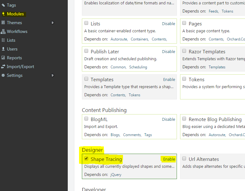
First, let's find out how Orchard handles this with the help of Designer Tools. If you are using Orchard 1.7 or higher then this module comes with default and don't try to install it because you may run into compatiblity issues. For those with older version you can install them from the Modules section. You need to enable Shape Tracing which will be disabled by default after installation and can be done from Modules as shown below


Connecting Azure Blob Storage account using Managed Identity
Posted 12/9/2022Securing Azure KeyVault connections using Managed Identity
Posted 11/26/2022Manage application settings with Azure KeyVault
Posted 11/9/2022Adding Serilog to Azure Functions created using .NET 5
Posted 4/3/2021Learn how to split log data into different tables using Serilog in ASP.NET Core
Posted 4/23/2020